

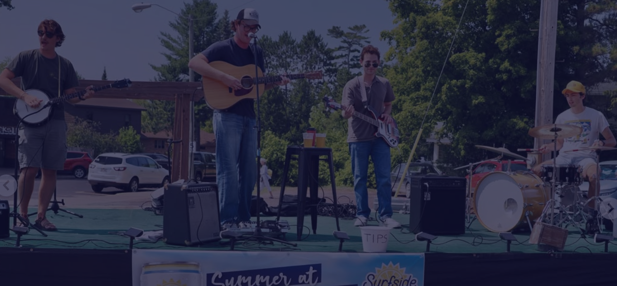



OK and the Contenders are a bluegrass band from Chicago whose current audience finds them through word of mouth and their social media presence. They are looking to grow from playing in local bars to touring with an original album, and to build a larger following using their current methods.
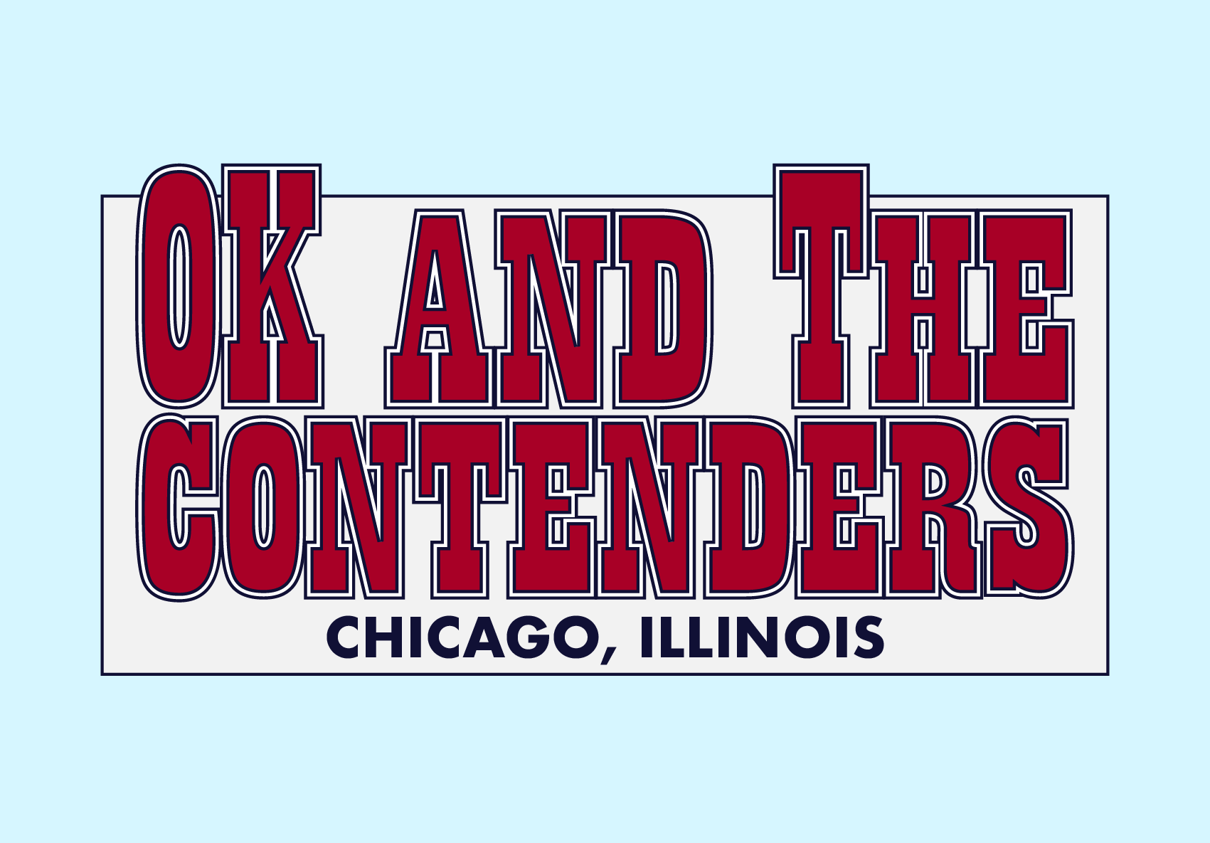
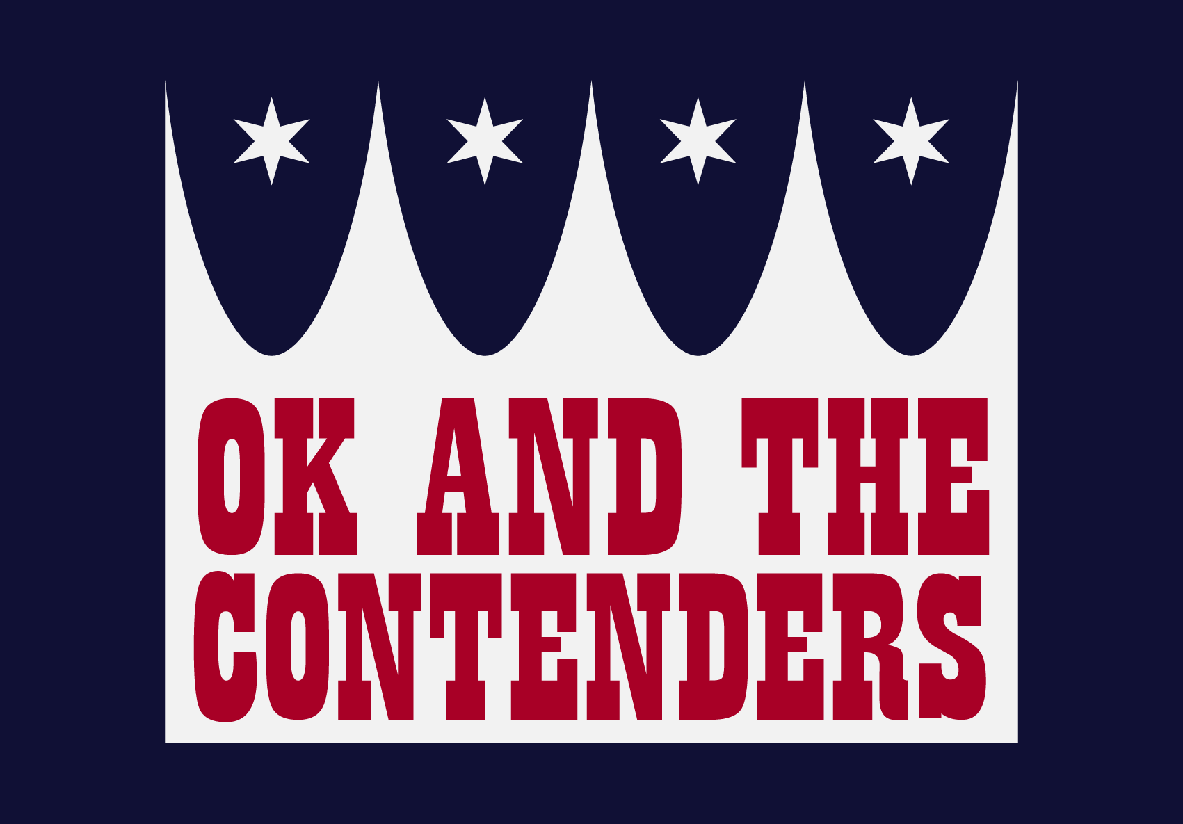
I worked with OK and the Contenders in the fall of 2026 to develop a logo suite and brand guidelines, and gave them templates and suggestions to help kickstart their social media.
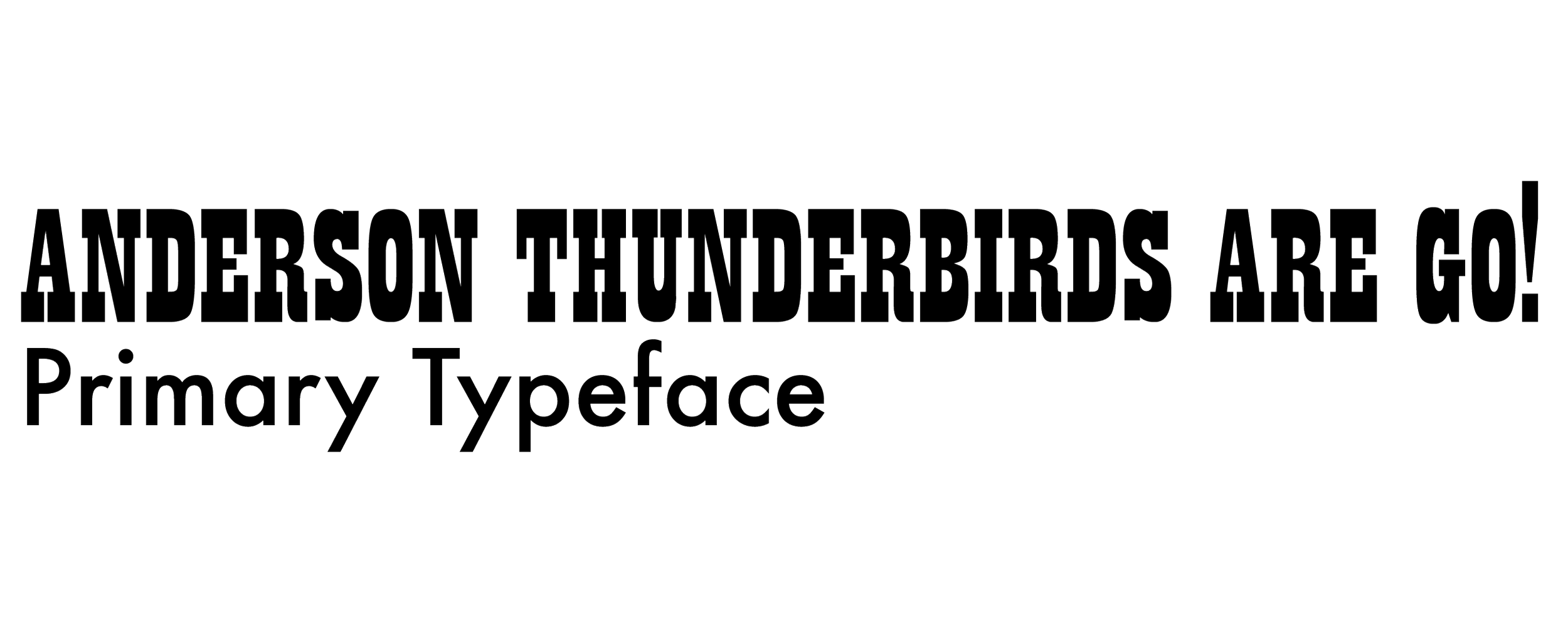
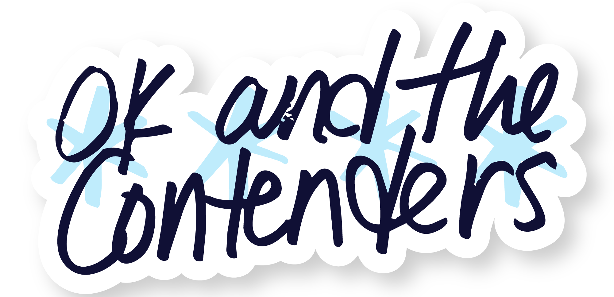
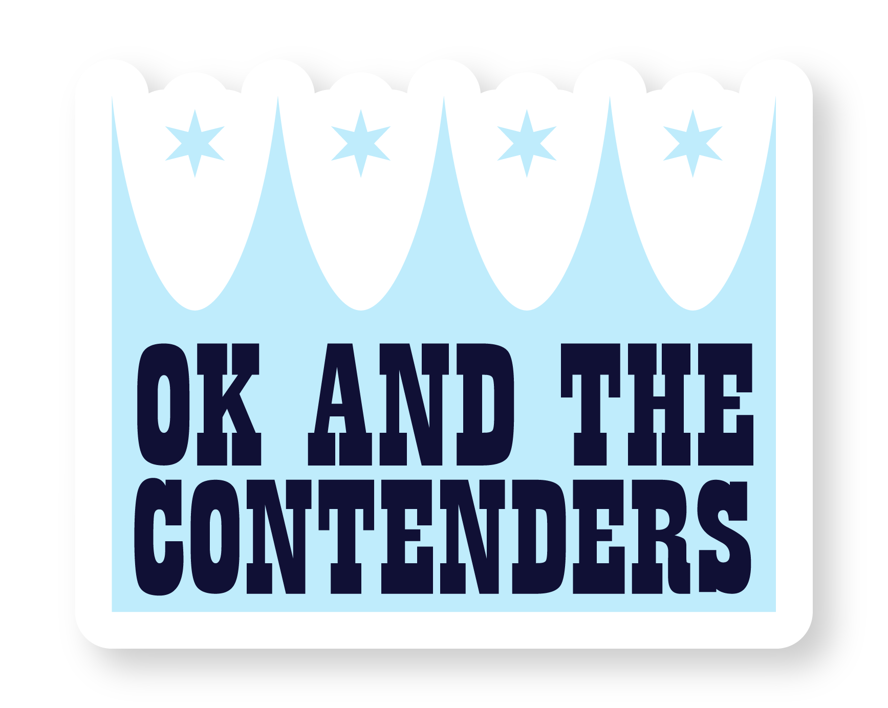
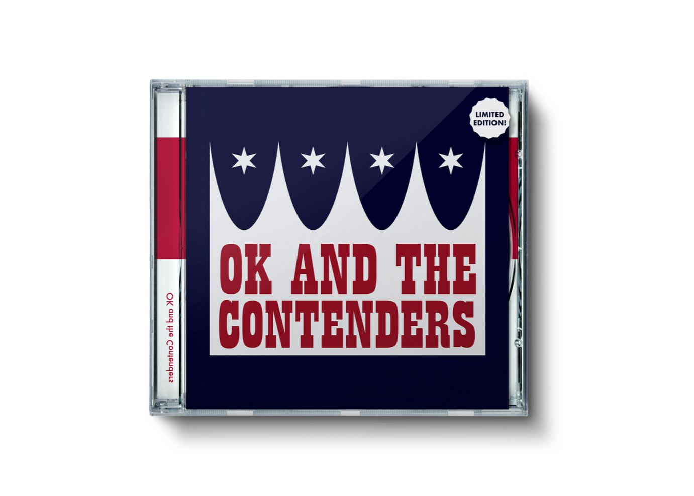
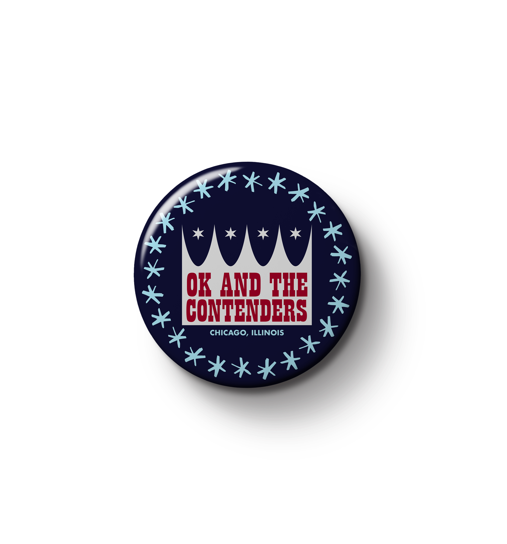
Ok and the Contenders were looking for a text-forward logo that evoked their country influences and referenced their Chicago roots. They were inspired by Flatt and Scruggs’ branding as well as graphic logos like that of the Hartford Whalers. These guidelines led me to use a blocky slab serif, primary colors, and simple, geometric shapes.
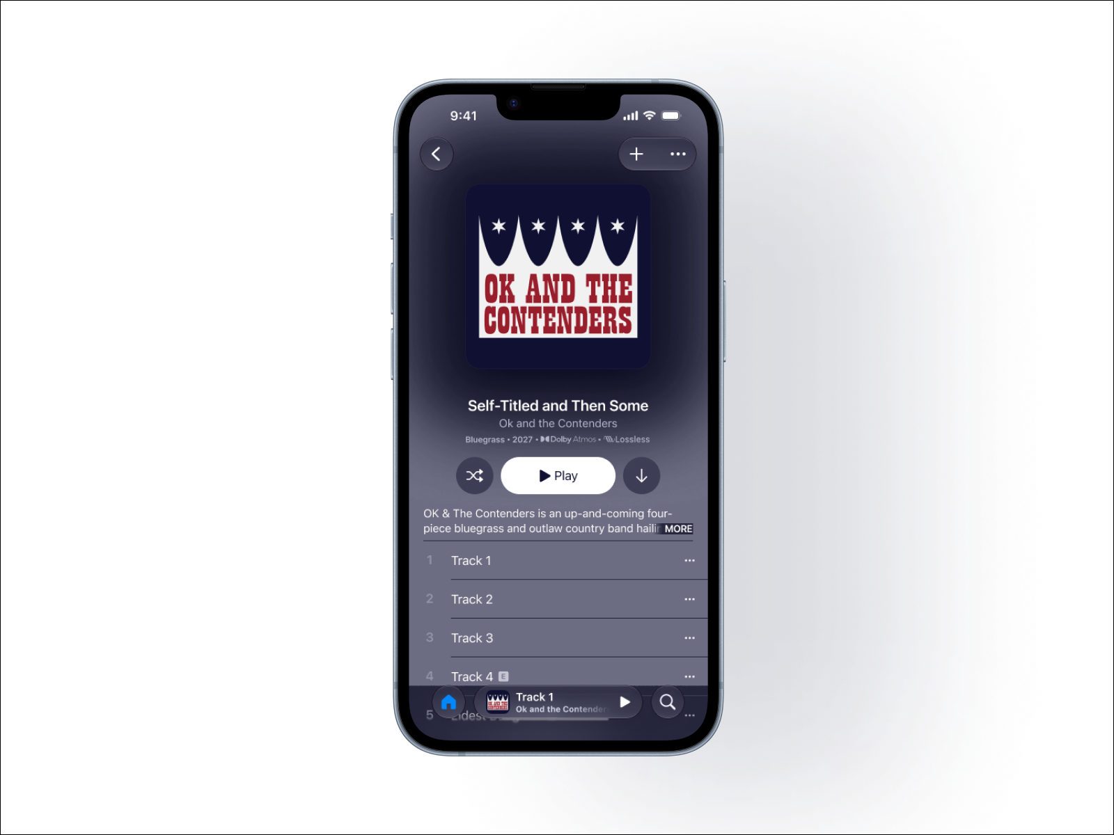
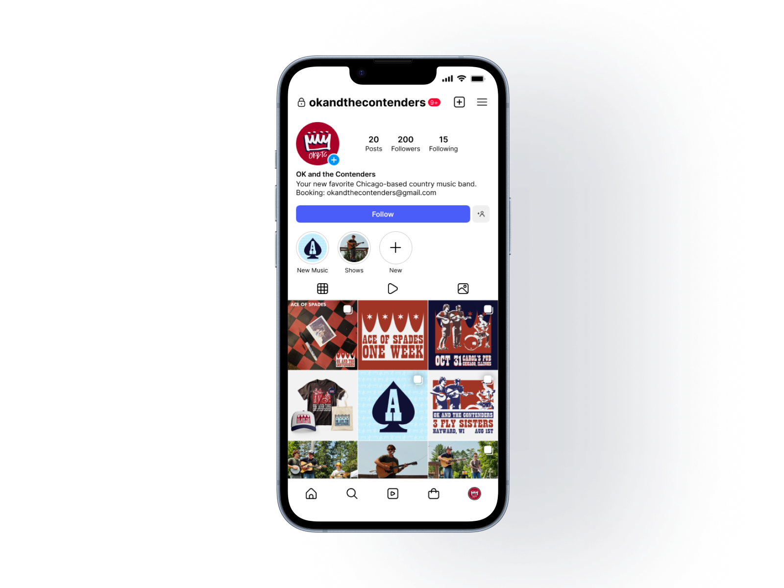
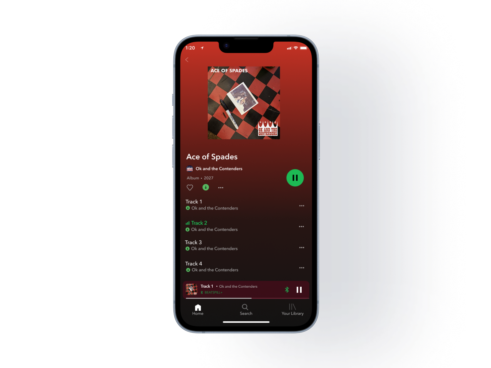
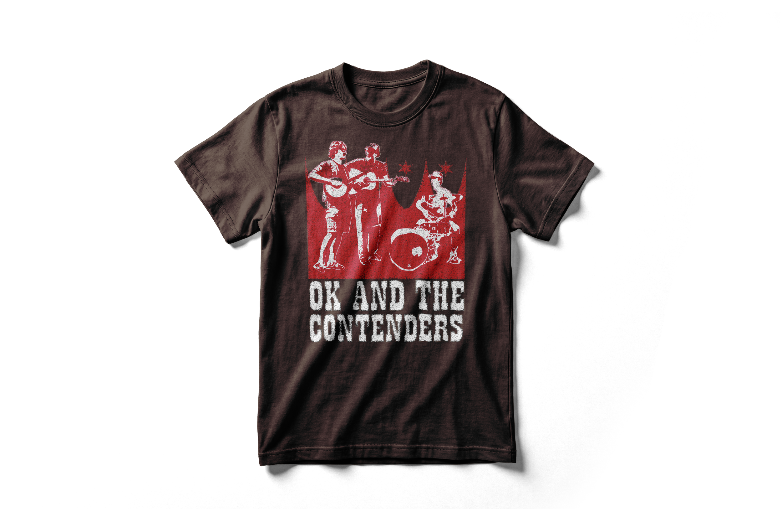
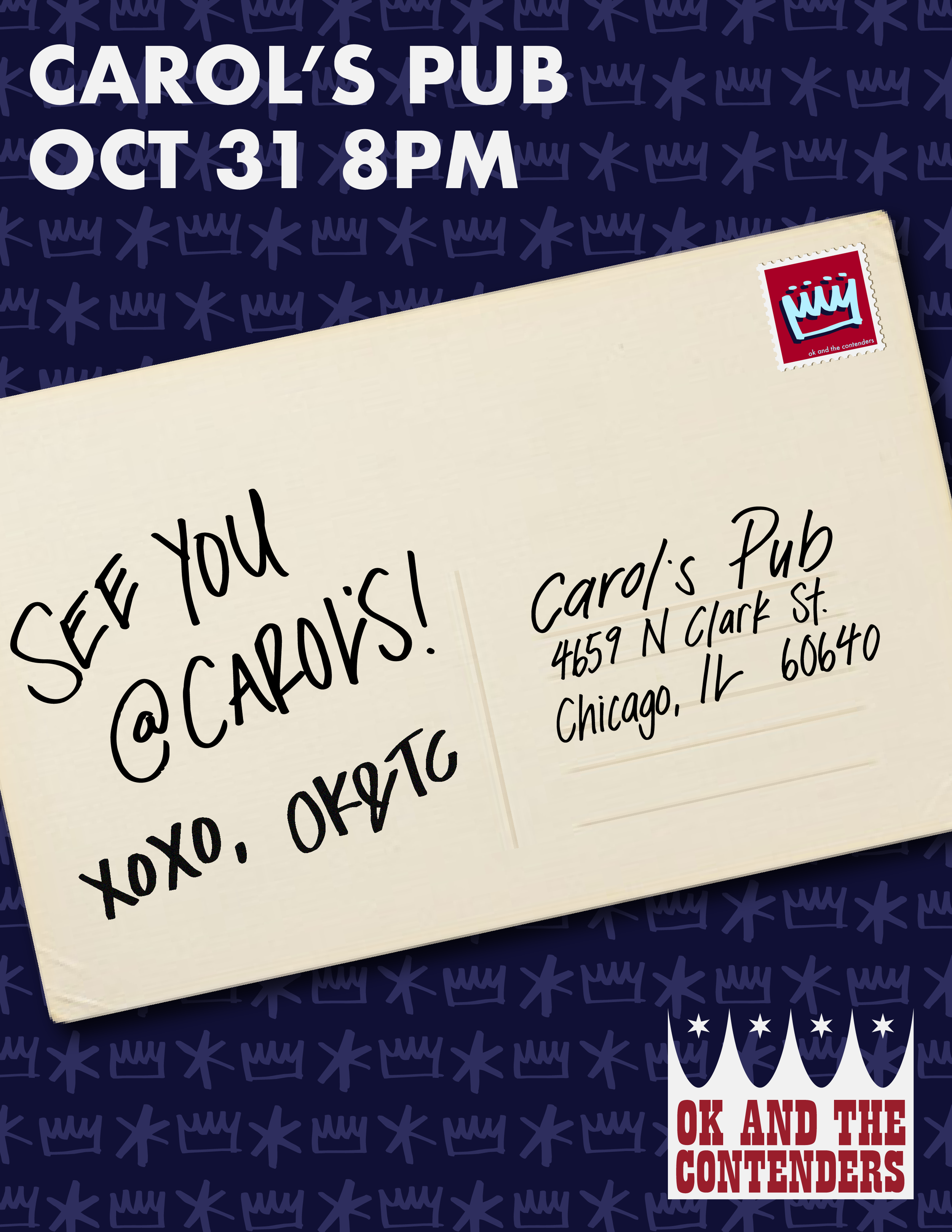
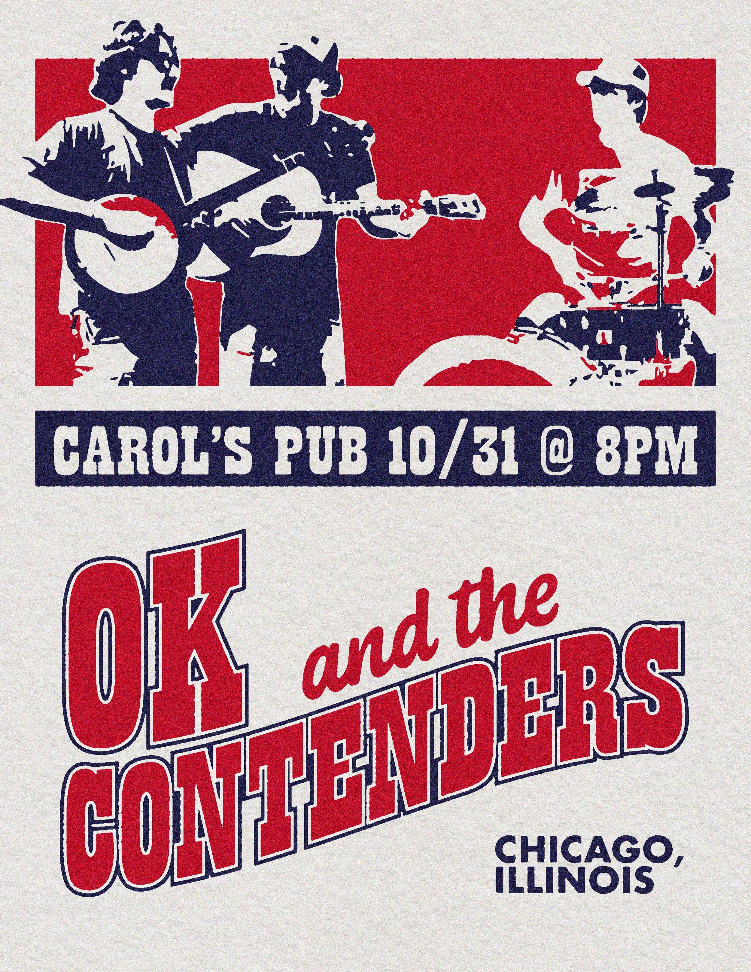
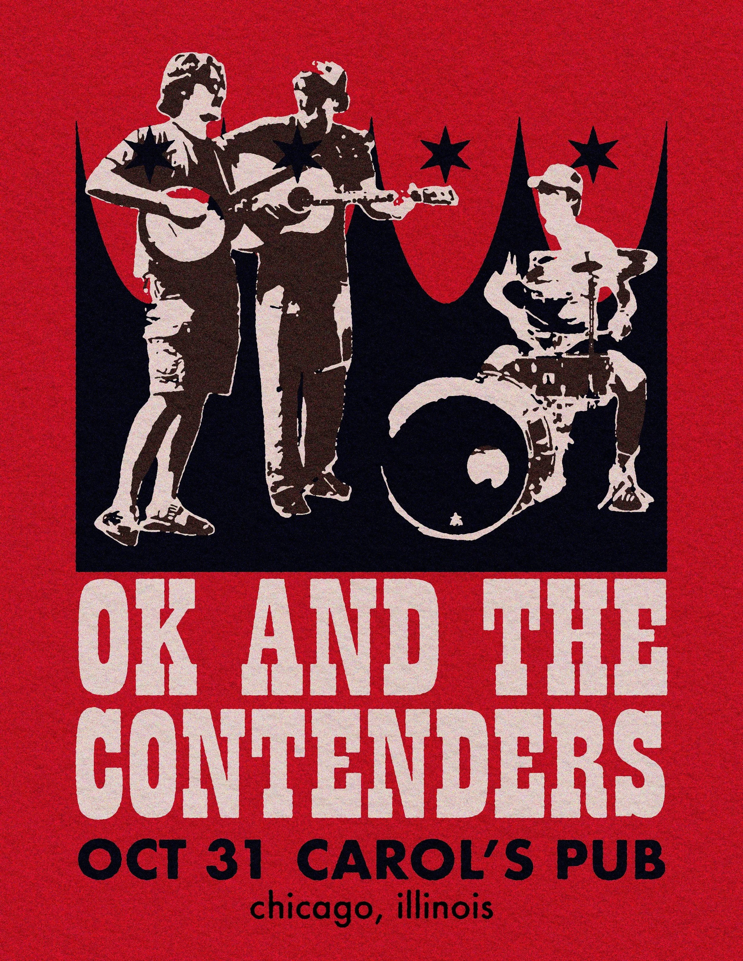
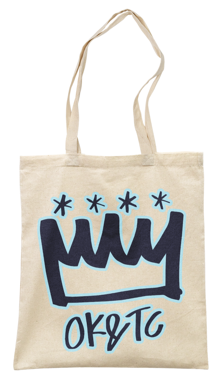
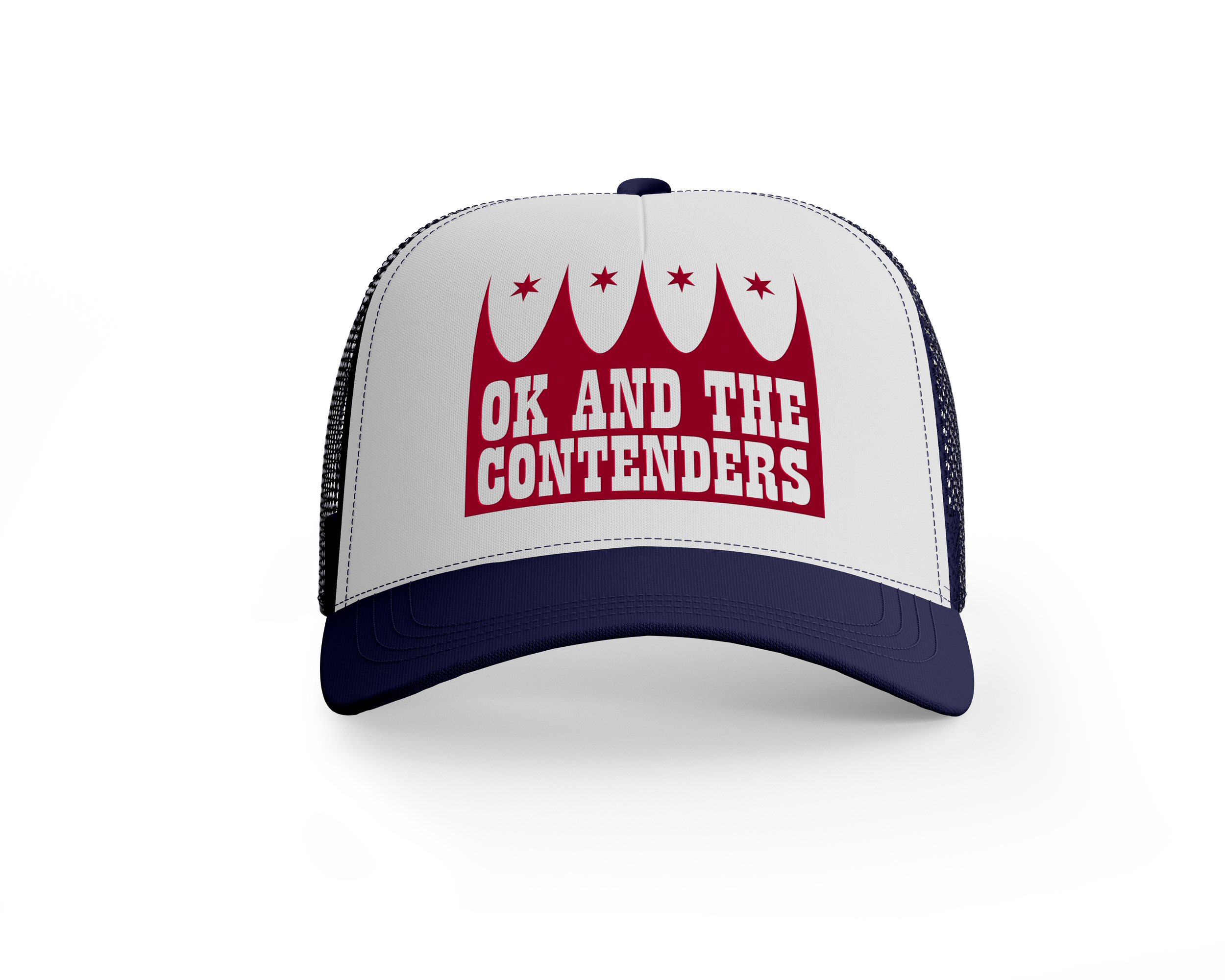
I worked with the band to design poster concepts for an upcoming show, leaving them with templates that they could adapt for future shows. I also mocked up merch for them, using their new branding guidelines.
This project has not yet been launched by the band. They anticipate making these changes in Spring 2027, as they prepare to go on tour.